HarshaFont is a font made from a photo of a handwritten alphabet. You can download HarshaFont (zip) and use it.
Here is how to make a font of your own handwriting. You print a page, fill it in, take a photo, and Claude Code or Codex does the rest.
1. Print the template
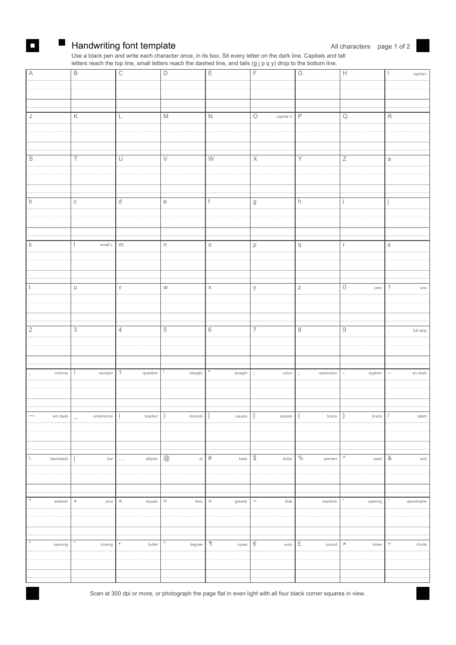
Print page 1 on A4 or Letter paper at 100% size. Page 2 is optional and page 3 is only a reference, so you can leave them on the screen.
2. Fill it in
- Use a black pen that makes a line of at least 0.5 mm. A gel pen or a fineliner works. A thin ballpoint gives a thin, broken font.
- Write one character in each box. The small gray character in the corner tells you which one.
- Sit every letter on the dark line.
- Capitals and tall letters like
b d h k lreach the top line. - Small letters like
a c e n oreach the dashed line. - Tails of
g j p q ydrop to the bottom line. - Don’t touch the edges of the box.
- If you are not sure where a comma or a quote mark should sit, look at page 3 of the PDF.
- Skip any character you don’t want. It will be left out of the font.
Page 2 has five sentences to copy at your normal size. It is optional, but it helps get the spacing between letters right.
3. Take a photo
Lay the page flat in even light and photograph it from straight above. All four black corner squares have to be in the picture. A scan at 300 dpi or more is even better.
4. Give it to your coding agent
Open Claude Code or Codex in any folder, attach your photo, and paste this. Change the font name in the first line.
Make a font called "My Hand" from the attached photo, following these instructions.

---
name: handwriting-font
description: Make an installable font from a photo or scan of a filled-in handwriting template (one printed page with a box per character). Use when the user wants a font of their handwriting, hands over a photo of the template, or wants to fix a font made this way.
---

# Handwriting font

The user has printed a one-page template, written one character in each box, and
given you a photo or scan of it. Turn it into a font file (TTF, plus WOFF2 for
the web). Write whatever code you need, in whatever you have available. An image
library and a font library are enough; Python with OpenCV and fontTools has done
this job before.

The blank template is at
https://raw.githubusercontent.com/syllogismos/syllogismos.github.io/master/skills/handwriting-font/handwriting-font-template.pdf

## The template

All measurements are millimetres from the top-left corner of an A4 page
(210 x 297).

- **Corner marks.** Four black squares, 6 mm wide, with top-left corners at
  (12, 18), (192, 18), (12, 270.5) and (192, 270.5). The one at (12, 18) has a
  2 mm white centre. That is how you tell which way up the page is.
- **Page number.** Three 3 mm squares at y = 18 and x = 21, 24, 27: a binary
  number, left square worth 4. Page 1 has only the right one filled. Page 2 has
  only the middle one.
- **Boxes (page 1).** A grid starting at (12, 32): 9 columns, 12 rows, each box
  20.667 wide and 19.708 tall, drawn with dark outlines.
- **Inside each box**, measured down from the top of the box: a small printed
  label in the top 3.5 mm; the top line at 5.1; a dashed line at 8.9; the
  baseline (darker) at 13.7; the bottom line at 17.4. Capitals and tall letters
  reach the top line, small letters reach the dashed line, everything sits on
  the baseline, and tails reach the bottom line. The guide lines are light gray.
- **Characters**, left to right, row by row:

  ```
  A B C D E F G H I
  J K L M N O P Q R
  S T U V W X Y Z a
  b c d e f g h i j
  k l m n o p q r s
  t u v w x y z 0 1
  2 3 4 5 6 7 8 9 .
  , ! ? ' " : ; - –
  — _ ( ) [ ] { } /
  \ | … @ # $ % ^ &
  * + = < > ~ ` ‘ ’
  “ ” • ° ₹ € £ × ÷
  ```

  Row 8 ends with a hyphen then an en dash; row 9 starts with an em dash. The
  two quotes in row 8 are straight; the four at the end of row 11 and start of
  row 12 are curly.
- **Page 2 (optional).** Five sentences, each copied by hand on ruled lines
  below it, at normal writing size. The blocks start at y = 39 and repeat every
  30 mm, spanning x = 12 to 198. Use it only as a picture of the person's real
  spacing.
- **Page 3** is a printed reference. Nobody writes on it. Ignore it.

## What to do

1. **Straighten the page.** Find the four black squares in the photo, work out
   which is top-left from its white centre, and warp the image so the page is
   flat and square at about 16 pixels per millimetre. The photo may be rotated,
   at an angle, or on a cluttered desk. If you cannot find all four squares, ask
   for a better photo. Do not guess the corners by eye.
2. **Separate pen from paper.** Measure how dark each pixel is compared with the
   paper around it, so shadows do not count as ink. Use the darkest colour
   channel, so blue ink counts as dark. The pen must be told apart from the
   printed guide lines: measure how dark the baseline is on this page, measure
   how dark the pen is, and put the cut-off between them, nearer the guide line.
3. **Cut out each box.** Do not trust the grid positions to the pixel: find each
   box's printed edges near where they should be. Stay 0.6 mm inside the edges
   and below the label strip. Keep each character's position relative to its
   baseline; do not crop it tight and lose that. Throw away specks. A box with
   no ink is left out of the font.
4. **Show the person what you found** before building anything: one picture of
   every box as you extracted it, with the guide lines drawn in. Look at it
   yourself first. Check for letters cut off at a box edge, the wrong character
   in a box (O and 0, l and I and 1, the three dashes, straight and curly
   quotes), stray marks, strokes with gaps in them, and letters far from the
   baseline.
5. **Fix problems by rewriting, not retouching.** If a character is wrong, the
   person writes it again on a fresh print and sends a new photo; use the new
   box for that character. Never redraw or "improve" a letter. Odd shapes are
   the handwriting. Point them out and let the person decide.
6. **Trace the outlines.** Enlarge each character and cut the outline from how
   dark the ink is, not from a black-and-white mask, then smooth it and use
   curves. Outer shapes and holes must wind in opposite directions.
7. **Build the font.** 1000 units per em. The baseline is y = 0 and the top line
   is 700, so 1 mm on the page is about 81 units. Then:
   - Apply one scale to the whole font so the typical capital is 700 tall.
   - Nudge letters that should sit on the baseline onto it, if they are close.
   - Leave everything else where it was written. Do not stretch single letters
     to a standard height; that distorts the handwriting.
   - Give every character a little space on both sides (about 45 units) and make
     the space character about 300 wide.
   - If a curly quote or a long dash was not written, map it to the straight
     quote or the hyphen. If the ellipsis is missing, make it from three of the
     person's full stops.
   - Set the ascent and descent to cover the tallest and deepest ink. Set the
     family name, style "Regular", a version number and real creation dates.
8. **Show a specimen** made with the finished font: every character on guide
   lines, the five sentences from page 2, and a paragraph of small text. If page
   2 was filled in, compare the spacing with the person's own writing and adjust
   the side spacing to match.
9. **Hand over** the TTF and WOFF2. Say which characters are missing. To install,
   open the TTF and choose Install.

## Mistakes already made once

- **Cropped letters.** Straightening by the paper's own corners cut off the top
  row. Use the printed squares.
- **Uneven heights.** A font built from a sheet with no guide lines had a `g`
  three times the height of a `q`. The guide lines exist to prevent this; keep
  each character's position relative to them.
- **The desk and paper edge read as ink.** Only look inside the boxes.
- **Jagged edges** in large text, from tracing a black-and-white mask with
  straight lines.
- **A thin, broken font** from a thin pen. If strokes have gaps, ask for a
  rewrite with a pen of 0.5 mm or more. Do not thicken the font unless asked;
  a faked bold was tried and rejected on sight.
- **The old font kept showing after a rebuild.** Raise the version number every
  time, and tell the person to remove the old font before installing the new one.
- **A rebuild that silently did not run**, so nothing changed. After any fix,
  check the output file is actually new.
- **A cursive version** made from the same sample was rejected outright. Do not
  offer one.

## What this does not give you

No kerning pairs, no joined-up writing, no accented letters, and one drawing for
each character.
The agent shows you every character it found before it builds anything. If a letter came out badly, write just that one again on a fresh print and send the new photo.
5. Install the font
The agent gives you a .ttf file. Open it and click Install. On Windows, right click it and choose Install.
A note: I have tested this on simulated photos of the page, not yet on a real printed sheet. If it breaks for you, tell me.